Technology
Where does your electricity come from right now? A live dashboard of Hungary's power system
A Hungarian site shows in near real time how much the country consumes and produces, where imported power comes from, and how much the sun contributes. We looked at what it is actually good for and how to read its numbers.
2026-08-03 · 7 min
Electricity is one of the most invisible things in daily life: you flip a switch and it works. What we rarely know is where those watts come from right now — a domestic gas plant, a neighbouring country's grid, or the afternoon sunshine. The Hungarian energy data site Hol a delej? ("Where's the juice?") answers that question almost in real time, summarising on a single screen what is happening in the Hungarian power system.
What do you see when you open it?
The landing screen is less a technical report than a dashboard. At the top runs the grid frequency, the system's heartbeat: when the value around 50 hertz drifts, generation and consumption are out of balance. Below it come the big numbers: how much the country consumes, how much it generates, how much arrives via imports, and how much of that is solar.
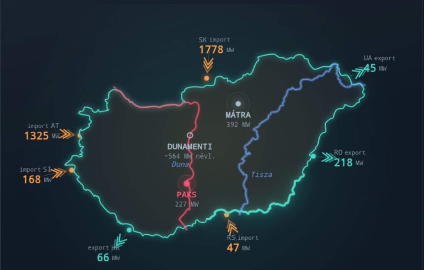
The diagram of interconnections with neighbouring countries is especially telling. Next to Austria, Slovakia, Ukraine, Romania, Serbia, Croatia and Slovenia, arrows show whether power is flowing in or out and at what capacity. At a glance it reveals what statistical tables only yield after long calculation: for much of the day Hungary is a net importer, and in the evening hours it leans heavily on its neighbours.
Consumption, generation, imports — why do these three numbers matter together?
Separately each figure is abstract. Together they tell a very simple story. When consumption exceeds domestic generation, the difference has to be brought in from somewhere. That is not a disaster — European grids are interconnected precisely to help each other out — but it says a lot about how exposed we are to regional prices and weather.
The site makes this even more tangible with comparisons anyone can picture: how this amount of power compares to the average consumption of all Hungarian households, how many kilometres an electric car could drive on it, how many kettles would draw that much at once. These are order-of-magnitude illustrations rather than engineering calculations, but they serve exactly the purpose the site was built for: turning megawatts into something you can grasp.
The energy mix: how much does the sun really give?
Solar has become the biggest transformer of the Hungarian power system in recent years. On a clear summer noon, solar farms and rooftops together supply a surprisingly large share of domestic generation — visible live, in percentages, on the site. In the evening, however, when consumption peaks, solar produces nothing, and the same system suddenly depends on gas plants and imports.
This daily swing is one of the most instructive things to observe here. Watch it for a few days and you understand much better why experts talk about storage, flexibility and smart consumption: the bottleneck is not the amount of solar energy but its timing.
Paks and the cooling water question
A separate block tracks the current output of the Paks nuclear plant, and in the summer of 2026 that is particularly telling. Because of the record-low water level of the Danube, cooling water supply has become constrained, so the plant runs at lower output than usual. The explanation the site also highlights is simple yet surprising: the problem is not fuel or technology but physics and regulation — cooling water has to be drawn from a certain level, and the temperature of the returned water must stay below an environmental limit.
As a result, the few hundred megawatts missing at Paks show up immediately on the import side. That is exactly the connection the site makes visible: a river's water level and the national energy balance behind household electricity bills are part of the same system.
Market prices and the timing of consumption
The displayed exchange prices show the hourly wholesale market price, that is, what electricity costs traders in a given hour. Linked to this is perhaps the site's most useful feature: an hourly band showing when a larger share of consumption comes from imports and fossil plants, and when less does. Hence the practical advice: run the washing machine, dishwasher, dryer, water heater or EV charging in the "good" hours, and avoid the late-afternoon and early-evening peak, when the system operator also asks for restraint.
One important clarification: regulated tariffs don't change by the hour
It is worth being clear about what this does and does not mean for consumers. The residential, regulated tariff is fixed: it does not follow hourly market prices. So doing laundry at noon will not make your own bill smaller than doing it in the evening — at least not without a time-of-use or dynamic tariff.
Favourable hours therefore matter primarily from a grid load and environmental perspective: shifting consumption away from the peak means less import and less fossil generation, a lighter evening peak and lower overall emissions. That counts a great deal nationally, but for most households it will not show up on the monthly bill. Anyone looking for direct savings should examine their contract type and metering rather than the price chart.
Who should check it regularly?
- Households with solar panels, who want to know when it makes sense to time big appliances to their own generation.
- EV drivers, for whom charging time is already a daily decision.
- Students and teachers, because there is hardly a more vivid teaching aid for how a power system works.
- Curious readers, who want numbers and pictures behind the words "imports", "energy mix" and "peak load" heard in the news.
What to keep in mind when reading the numbers
This is an independent informational data visualisation, not an official system operator publication. Data typically updates with a short delay, and for some hours measured values may not be available yet, with the earlier daily pattern shown for guidance. That makes it excellent for orientation, learning and grasping magnitudes — but anyone making a serious decision, such as planning an investment, calculating a contract or writing a professional analysis, should also check the original official data sources.
Even with that caveat, a site like this is rare and valuable. Energy policy debate here often runs on slogans, while the workings of the system are exactly the kind of topic one good chart explains better than ten statements. If you are curious where the electricity in your flat comes from at this very minute, open the Hol a delej? live energy data page and check it at different times of day for a few days — you will never look at a light switch the same way.